I am so excited to share with you our freshly painted, newly organized Paper & Cake office design! This is a makeover 10 years in the making, and I couldn’t be more thrilled with how it turned out.

But first, yes. I am embarrassed. Well no, not really. I know this office-of-the-past was sad and pathetic to the naked eye, but what it lacked in style it MORE than made up for in creativity! We’ve churned out Paper & Cake partyware for nearly 8 years in the space. EIGHT! My absolute favorite family, friends, employees, interns and, of course, my kids have worked here in this office. From this space we put out products that were seen on the Today Show, that have appeared in national magazines and catalogs, and, most importantly, that have made. kids. smile. Now, don’t judge. Its a mess.


It’s even WORSE now looking back at these photos. This hodge podge of desks and mis-matched furniture were cobbled together out of necessity. A party designer has SO much stuff! From tape and glue to useless software from the 90s. There was a place for everything, even if that meant piling it to the ceiling. Thank goodness I took the time to get rid of so much of it, and then to find new hiding places for the rest of it…

After emptying out the entire space, I painted. And painted. And painted.


Looks good, right? That is Midnight Sun and Silver City from Dunn Edwards. Gorgeous. After painting the office, I had one more DIY project to do – refurbishing a vintage settee. It was so ugly!

After taking off all the upholstery, I sanded the whole thing down and did 2 coats of a really good gray primer. Sanding in between, I topped it off with a coat of white. I decided to distress it just a touch by lightly sanding back the white to show some gray beneath. Then finished the wood with a bit of furniture wax.

Ta Da! It is so cozy. I sit there a lot. Like way too much. And now for the rest of it…… here is my throne workstation. I just LOVE the party pics above! I can’t help but smile.

I couldn’t call this office design complete without my logo. A big beautiful shiny acrylic logo! This logo was expertly cut by Delovely Details, and expertly designed by Christine McClain Design.

On the opposite side of the room, cube style shelving from Ikea was installed with P&C party vignettes in mind. Each tiny space contains a fun bit from a recent product shoot. Well, all except that one on the end – stir sticks with our logo from Delovely Details!

This is my absolute favorite part of the room… a cutting and production table that is tall enough to stand at without bending over! No more back breaking work… just easy perfect functional. There is even a spot to plug in the glue gun!

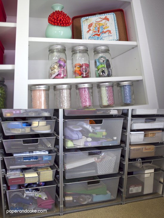
And are you wondering what is in all those boxes, bins and jars? Everything up top is for packaging pretty pretty partyware. All the drawers below (from the container store) hold SO much stuff! Paper, punches, tape, glue, packaging bags, sharps, labels…. etc.

We have two workhorse machines that needed to be integrated into the design of the space. The printer and the die cut machine are used everyday, all day and had to be highly accessible. They are exactly where we need them.

Are you wondering why it is so dang clean in here? Well, we’ve hidden away table legs, cords and clutter by adding “cord runs” and flush mounted power strips.

I wanted to let you all know that my interior designer, DeEtte, (nope, I didn’t work alone!) and my carpenter, Dan, are available and ready to go for anyone who needs them! We are all located in Southern California, so shoot me an email for their information. And lastly, this really has been an amazing change for me and Paper & Cake – I am more excited and more inspired, than ever, to work in my beautiful new office. Let me know if you have any questions about it, I would be happy to share!
